The State of Wayfair's Search Function
UX Consulting
Case Study
Although one of the better e-commerce sites, I have identified certain issues that the Wayfair.com site search functionality could improve.
Key Takeaways
There were many positive elements I gathered from working through the search function on Wayfair.com; however, in order to compete with the best e-commerce websites, I propose a few changes in this brief summary. I have generated a plethora of questions, mostly regarding analytics and user testing. As Ch’ien Chan emphasizes, “Wayfair is data-driven company,” and I would love to have the conversation about the analytics regarding the search and the user testing results. For brevity, I have summarized my main points here and produced a separate detailed UX report.
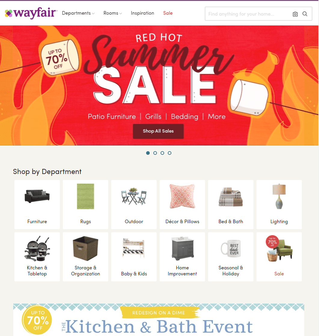
Search bar placement
Wayfair’s mobile friendly version and the native app have a good idea in fixing the search bar at the top of the screen—following the user everywhere they go.
The Wayfair.com desktop website on the other hand falls a bit short, by forcing the user to think about where the search box could be while scrolling through pages.

Figure 1. Why force the user to click twice to get the search bar to reappear?
Additionally, as a user goes to another page, they lose the search function all together. For example, I wanted to take advantage of the amazing Clearance sale, but I was left without the ability to search.

Figure 2. Where did the search bar go?
UPDATE: As of this posting, this issue has been modified. (I am not sure if it was based on this critique or not.)
Walmart’s search function is ranked #2, according to the Baymard Institute’s usability study among top e-commerce sites. Their search bar is fixed to the top allowing the users to scroll up and down each page with the bar still present.

Figure 3. Walmart’s search bar stands on its own.
Amazon, Walmart, and Overstock.com to name a few, position their search box front and center; making it the first thing the user sees at the homepage. As seen below (Figure 4), Pinterest will not let you get away from their search box!

Figure 4. Pinterest’s search bar is clean, centered, and fixed, making it hard to miss.
Metadata Display
To help the user specify their queries, Amazon and Walmart display metadata as an option within the search function. This allows users to choose departments, deals, best sellers, shipping, etc., directly on the search bar.
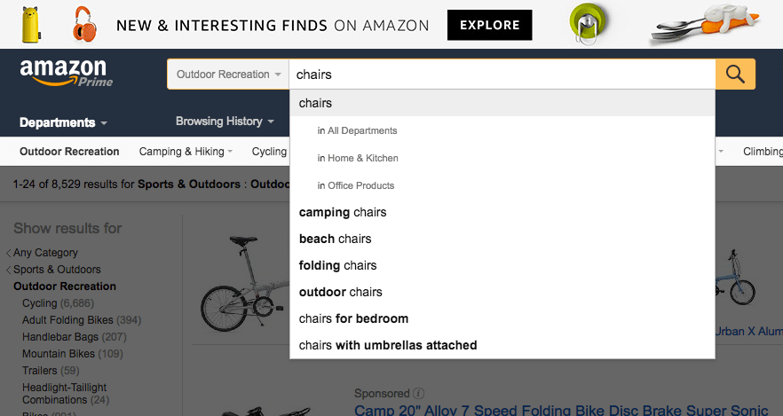
Figure 5. Amazon allows users to filter directly on their search bar.
Wayfair has a different approach to presenting their metadata. One questions if this is more efficient for the user.

Figure 6. Wayfair chooses to have the choices separated from the search bar.
Short-term solution: Although Wayfair makes the Departments, Rooms, Inspiration, and Sales available to the left of the search bar, this potentially could take away from the search function by forcing the user to “think” and do more, rather than having the data displayed with autocomplete. In other words, minimize all work for the user.
Synonyms, Semantics, and Phonetics oh my… (I’ll add natural language recognition too)
How well does Wayfair’s search function map product names with synonyms or colloquial names? For example, searching for a ‘chaise’, I am happy to get plenty of chaise lounge chair options, but when searching for ‘fainting chair’, I get nothing of relevance—unless end tables are the new fainting chairs!
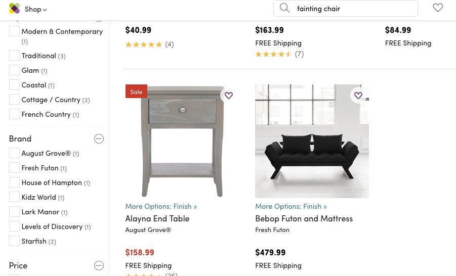
Figure 7. Whoops, that fainting chair looks like a table!
Long-term solution: Map a set of synonyms and natural language queries to product types, product names, and category names. In addition, having voice recognition will be helpful for accessibility standards.
Faceted Search
According to Smashing Magazine, the #1 and #2 best e-commerce search sites are Amazon and Walmart. Both of those websites have fantastic faceted search features. The user is presented with a list of filters for the specific product being search, not just a generic site-wide filter option.
Wayfair.com has a respectable filtering process that I believe rivals with these other e-commerce giants. According to Baymard Institute’s 2014 study, it ranked #4 in this overall area. From my research, it looks to have evolved since then.
Autocomplete
The autocomplete is excellent. Should there be images that go along with the product names?
Breadcrumbs
The hierarchical breadcrumbs are useful and have been much improved in the last couple of years, according to what I have surveyed on Wayfair’s older versions (archive.org/web).
Conclusion
The potential to create a truly dynamic search engine is right at the doorstep, and with a few improvements this can be the champion of the e-commerce space. Picture recognition is a great addition, but it would be useful to include voice recognition for those in need of accessibility for a long-term goal. This has the possibility of increasing conversion rates and attracting a new set of users. Again, this will require a more robust engine that recognized natural language and synonyms. Here is a quick low-fi mock-up to encapsulate everything:
